Responsive Design Made Easy with CSS Media Queries
Написана давно - Время чтения: 8 минуты
Уроки CSS
Страницы в интернете становятся все более динамичными и адаптивными, и каскадные таблицы стилей (CSS) играют важную роль в создании пользовательского интерфейса. В этой статье мы рассмотрим тему CSS, а также обсудим важный аспект - медиа-запросы CSS.
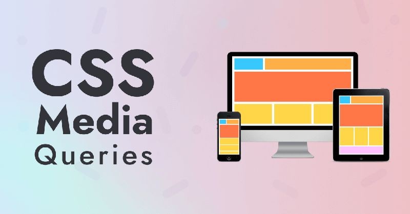
Understanding CSS Media Queries
Медиа-запросы CSS - это набор правил, которые делают возможным изменение стилей элементов на основе характеристик устройства, на котором отображается веб-страница. Эта техника позволяет создавать адаптивные дизайны, которые будут отлично выглядеть как на больших мониторах, так и на мобильных устройствах.
Основное преимущество медиа-запросов заключается в том, что они позволяют разработчику настраивать стили элементов в зависимости от ширины экрана, разрешения устройства, ориентации экрана, или других характеристик устройства. Это позволяет создавать удобные и привлекательные пользовательские интерфейсы, которые будут корректно отображаться на различных устройствах и экранах.
Пример использования медиа-запросов в CSS:
@media screen and (max-width: 600px) {
    body {
        background-color: lightblue;
    }
}
В данном примере мы использовали медиа-запрос, который изменяет цвет фона страницы на светло-голубой при ширине экрана менее 600px. Таким образом, на мобильных устройствах пользователи увидят страницу с другим цветом фона, что сделает ее более удобной для чтения и просмотра.
Преимущества использования медиа-запросов CSS:
- Создание адаптивного дизайна - страницы могут корректно отображаться на различных устройствах и экранах;
- Улучшение пользовательского опыта - удобный и приятный дизайн привлекает пользователей;
- Быстрая загрузка страниц - оптимизированные стили позволяют ускорить загрузку сайта;
- SEO-оптимизация - адаптивный дизайн влияет на ранжирование сайта в поисковых системах.
Использование медиа-запросов в CSS является неотъемлемой частью современной веб-разработки. Благодаря этой технике разработчики могут создавать уникальные и адаптивные дизайны, которые будут отлично выглядеть на различных устройствах и экранах. Поэтому не стоит забывать обучаться и совершенствовать свои навыки в области CSS и медиа-запросов, чтобы создавать качественные и современные веб-сайты.
Implementing Responsive Layouts
Responsive web design is a crucial aspect of modern web development. With the growing number of devices and screen sizes on which people access the internet, it is essential to ensure that your website looks good and functions well on all devices. CSS is a powerful tool that can help you create responsive layouts that adapt to different screen sizes.
Here are some key lessons in implementing responsive layouts with CSS:
-
Use Media Queries Media queries are a fundamental part of creating responsive layouts with CSS. They allow you to apply styles based on the size of the screen or device. By using media queries, you can set different styles for different screen sizes, ensuring that your website looks great on all devices.
-
Flexible Grid Layouts A flexible grid layout is another essential aspect of responsive web design. By using percentages instead of fixed pixel values for widths, you can create a layout that adapts to different screen sizes. This allows your website to adjust its layout and content to fit the available space on any device.
-
Use Relative Units When creating responsive layouts with CSS, it is important to use relative units such as ems or rems instead of fixed pixel values. Relative units adjust their size based on the font size of the parent element, making them more flexible and adaptable to different screen sizes.
-
Flexbox and Grid Layouts Flexbox and Grid Layouts are advanced CSS features that can help you create complex responsive layouts with ease. Flexbox allows you to create flexible layouts that automatically adjust to different screen sizes, while Grid Layouts enable you to create grid-based layouts that adapt to the available space on the screen.
-
Mobile-first Approach When designing responsive layouts, it is often a good idea to adopt a mobile-first approach. This means designing the mobile version of your website first and then progressively enhancing the layout for larger screen sizes. This approach ensures that your website is optimized for mobile devices and provides a better user experience on all devices.
In conclusion, implementing responsive layouts with CSS is essential for creating a modern and user-friendly website. By using media queries, flexible grid layouts, relative units, advanced CSS features like Flexbox and Grid Layouts, and adopting a mobile-first approach, you can ensure that your website looks great and functions well on all devices.
Optimizing Images for Different Devices
When it comes to building a website, optimizing images for different devices is crucial for a successful user experience. With the increasing variety of devices with varying screen resolutions and sizes, it's important to ensure that your images are optimized to load quickly and display properly on all devices.
Why image optimization is important
Image optimization is important for a number of reasons. Firstly, optimized images load faster, improving the overall performance of your website. This is particularly important for mobile users who may be on slower internet connections. Additionally, optimized images can help improve your website's SEO, as faster loading times are a key factor in search engine rankings.
Furthermore, optimized images can help ensure that your website looks great on all devices, regardless of screen size or resolution. By optimizing your images for different devices, you can guarantee that your website will be visually appealing to all users.
Best practices for optimizing images for different devices
There are several best practices to keep in mind when optimizing images for different devices:
- Choose the right file format: Different file formats have different levels of compression and quality. For photos, JPEG is usually the best option, while for logos or graphics, PNG is often preferred.
- Resize images appropriately: Make sure to resize your images to the correct dimensions for each device. This can help reduce the file size and improve loading times.
- Use responsive images: Use the srcset attribute to provide different image sizes for different devices. This allows the browser to choose the best image size for the user's device, improving loading times and overall performance.
- Compress images: Compressing images can significantly reduce file size without sacrificing quality. There are a number of online tools available to help you compress your images without losing quality.
Testing your optimized images
Once you have optimized your images for different devices, it's important to test them to ensure they display properly and load quickly on all devices. You can use tools such as Google PageSpeed Insights or GTmetrix to test the performance of your website and identify any areas for improvement.
By following these best practices and testing your optimized images, you can ensure that your website looks great and loads quickly on all devices, leading to a better user experience and improved SEO.
Testing and Debugging Responsiveness
Testing and debugging responsiveness is an important step in the web development process. With the increasing use of mobile devices, ensuring that your website looks and functions correctly on all screen sizes is crucial. Here are some tips and tools to help you test and debug the responsiveness of your CSS layout.
1. Use Developer Tools
Most modern browsers come with built-in developer tools that allow you to test your website's responsiveness. You can easily toggle between different device sizes and see how your website adapts to each one. These tools also allow you to inspect the CSS of your layout and make real-time changes to see how they affect the design.
2. Test on Real Devices
While developer tools are a great starting point, nothing beats testing your website on real devices. Borrow a friend's phone or tablet and see how your website looks on different devices and operating systems. This will give you a better idea of how your layout behaves in the real world.
3. Use Online Tools
There are also online tools available that can help you test the responsiveness of your website. Tools like BrowserStack and Responsinator allow you to see how your website looks on different devices and screen sizes without actually owning the devices.
4. Validate Your Code
Validating your CSS code is another important step in ensuring your website is responsive. Use tools like W3C CSS Validator to check for any errors or inconsistencies in your code. Fixing these errors can help improve the responsiveness of your layout.
5. Test Different Scenarios
When testing your website's responsiveness, make sure to test it in different scenarios. Try rotating the device, switching between portrait and landscape mode, and resizing the browser window. This will help you identify any layout issues and make necessary adjustments.
6. Check Performance
Responsive design not only involves appearance but also performance. Use tools like Google PageSpeed Insights to check the performance of your website on different devices. Optimizing images, minifying CSS and JavaScript, and reducing server response time can help improve the responsiveness of your website.
7. Get Feedback
Lastly, don't forget to get feedback from real users. Ask friends, family, or colleagues to test your website and provide feedback on its responsiveness. Their insights can help you identify any areas that need improvement and make your website more user-friendly.
By following these tips and using the right tools, you can test and debug the responsiveness of your CSS layout effectively and ensure a seamless user experience across all devices.